Draw A Sticky Note Using HTML and CSS
July 11, 2019
When I was reading the weekly update issue by @Ruan Yifeng, a tiny CSS component library caught my attention, PaperCSS. It’s interesting that the HTML elements can be presented just like a piece of paper, so I follow the CSS style panel in the browser developer tool and created some simple paper-like divs.
After that I still don’t get enough. How about we draw a sticky note using CSS? Let’s do it.
Our Target

Let’s Code!
Step 1: Set up Our “Canvas”
Firstly, let’s set up the container and the sticky note div with some random contents.
<div class="container">
  <div class="sticky-notes paper">
    You may not believe, but I am a piece of paper
  </div>
</div>
Then we format our html body to cover the full screen and centralize the sticky note div using flex layout.
html,
body {
  height: 100%;
  width: 100%;
  margin: 0;
}

.container {
  margin: none;
  background: lightblue;
  height: 100%;
  width: 100%;
  display: flex;
  align-items: center;
  justify-content: center;
}
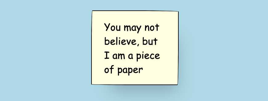
After it’s done, it looks like this

Step 2: Make It Looks Like Paper!
Now let’s create a css class named “paper”.
Here is the magic: utilising the border top right, top left, bottom right and bottom left radius to make the edges of the sticky notes become rough. The pixel amounts can be random but have to be hugely different for every pair, such as border-top-right-radius: 68px 2px; where top border radius is 68px and the right border radius is 2px. In this way, it looks rough but not curved. Set the 4 corners and add a box shadow to make the sticky note looks like a paper.
Most importantly, choose a cute font so that it looks more natural. (Comic Sans MS is lousy but it’s the cutest font I can find which is one of the browser safe fonts.)
.paper {
  border: 1px solid;
  border-top-right-radius: 68px 2px;
  border-top-left-radius: 2px 53px;
  border-bottom-right-radius: 2px 73px;
  border-bottom-left-radius: 78px 1.3px;
  box-shadow: 15px 28px 25px -18px rgba(0, 0, 0, 0.2);
  font-family: "Comic Sans MS", "sans-serif";
}
Then let’s format the sticky notes with some height, width and background color and use flex layout to center the text both horizontally and vertically.
.sticky-notes {
  background-color: white;
  height: 80px;
  width: 100px;
  padding: 20px;
  display: flex;
  align-items: center;
  justify-content: center;
  background-color: lightyellow;
}

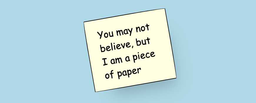
Step 3: Rotate the Sticky Note
When you put a sticky note on the white board, it’s hard to make it align well if you do not purposely adjust the positions. Therefore, rotating the sticky note a bit makes it look more vivid.
.sticky-notes {
  transform: rotate(-10deg);
  position: relative;
}

Step 4: Put A Pin on It
If you don’t put a pin on the sticky note, it falls! (Blame the gravity and poor quality of STICKY notes)
Use pseudo elements ::before and ::after to draw a big circle and a small circle, which look like a pin.
.sticky-notes::before,
.sticky-notes::after {
  content: "";
  background-color: darkred;
  position: absolute;
  border-radius: 50%;
  border: 2px solid #4c0000;
}

.sticky-notes::before {
  width: 20px;
  height: 20px;
  top: -10px;
  left: -10px;
}

.sticky-notes::after {
  width: 10px;
  height: 10px;
  top: -5px;
  left: -5px;
}
And that’s done!!

Final Results
See the Pen Sticky Note by YI ZHIYUE (@zhiyue-yi) on CodePen.